Introducing the Newly Redesigned Dynamic Response Navigation Menu
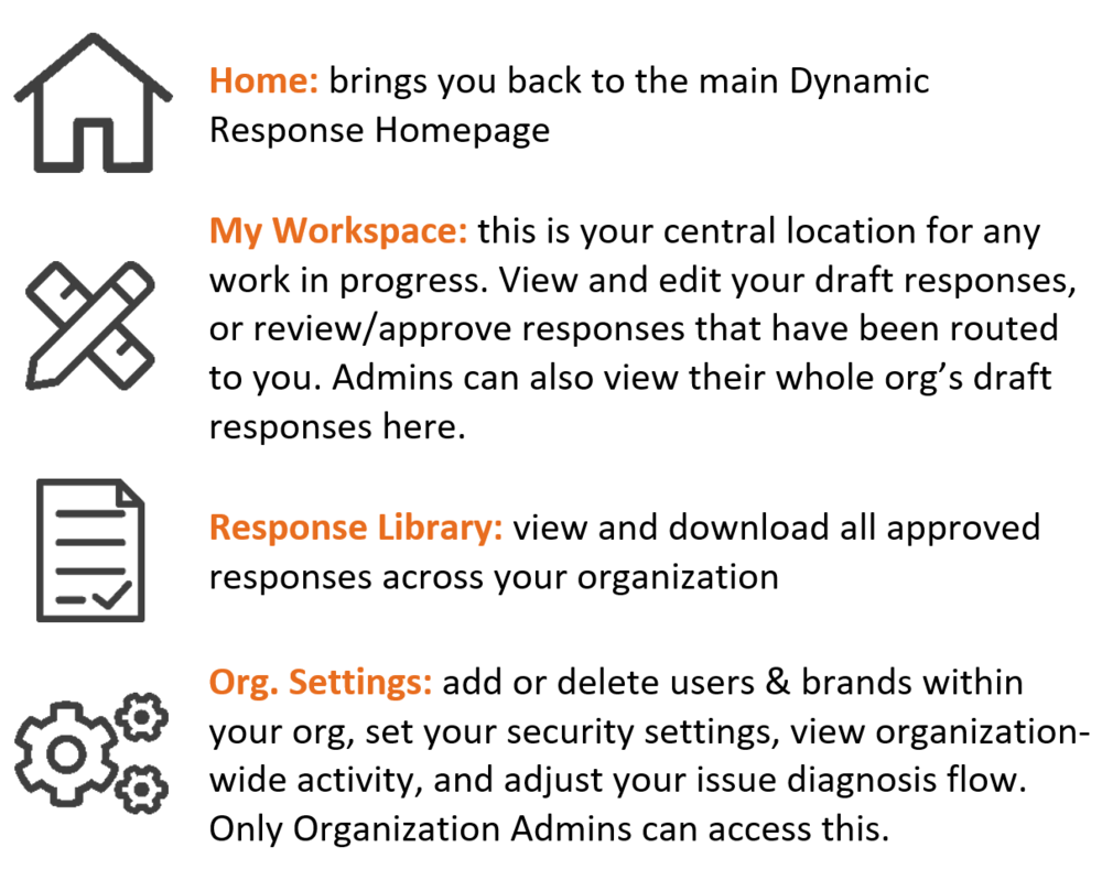
We’re constantly working to make the user interface for Dynamic Response more streamlined. To make the process of navigating the site more intuitive, we’ve replaced the existing menu buttons with a newly designed navigation bar.
The new navigation sidebar consists of 4 main icons:


